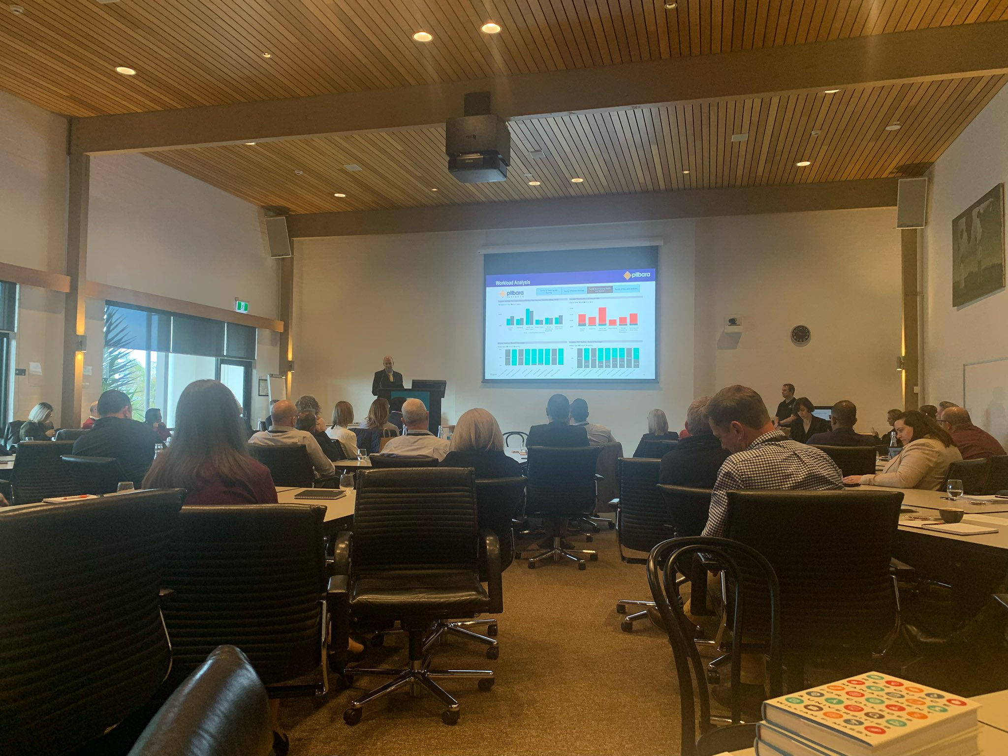
I was thrilled to be invited to present at the 2022 Australian University Senior Finance Officers Group (AUSFOG) conference last week alongside Thomas King from Microsoft. I was asked to present the reports that finance departments are actually using, so we took a look at 12 months of Power BI usage data to see which reports are the most used across all Australian universities using our models. Note, this doesn’t cover the live-connected Excel reports.
So the Top 5 most used Higher Ed Financial Reports in Australia are:
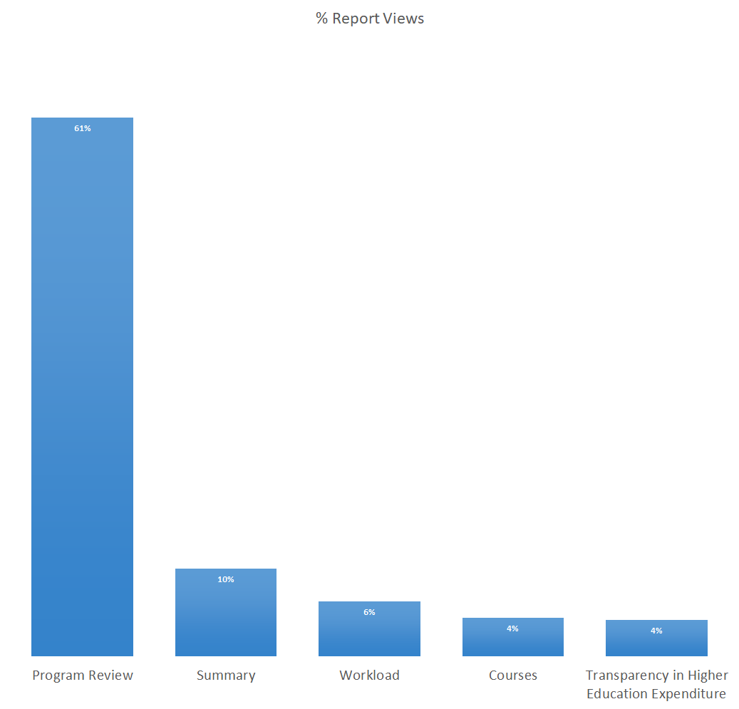
- Program Review
- Summary Reports
- Workloads
- Courses
- Transparency in Higher Education Expenditure
Program Review – #1
As you can see, Program Review is by far the most used report by finance across all universities, the obvious question is… why?
Speaking to the universities, they said it’s impossible to do Program Review properly in spreadsheets. This is due to the many-to-many relationships between courses and programs, coupled with the large amount of data from multiple source systems including finance, HR, payroll, facilities management, timetabling and student management. This creates a massive number of calculation paths, easily requiring 10’s of millions and even over 100 million rows of data and Excel can only handle around 1 million rows.
So what specific Program Review reports are used by financial management?
Program Overview
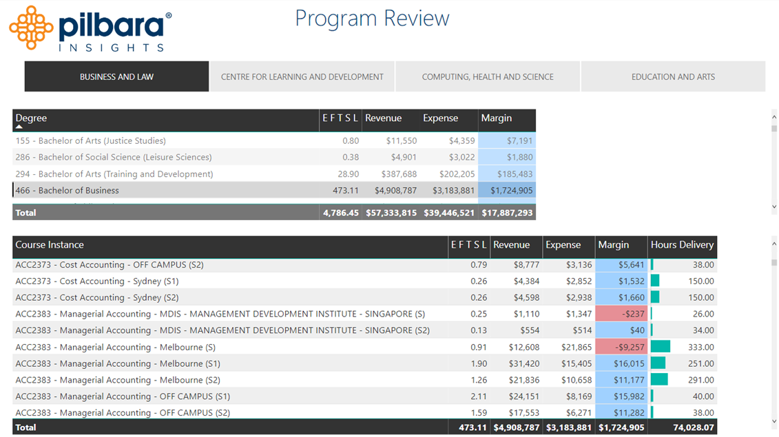
Program reports generally include revenue, expense, margin, EFTSL (or student FTE / student credit hours in US/Canada), delivery hours, staff FTE, program to course relationships.
In this report example, the relationships between programs and courses can be easily interrogated. A specific program can be selected and all of the associated courses will be filtered below and vice-versa, an individual course can be selected and all of the associated programs will be displayed above it.
Program Review – Owned Vs Taught
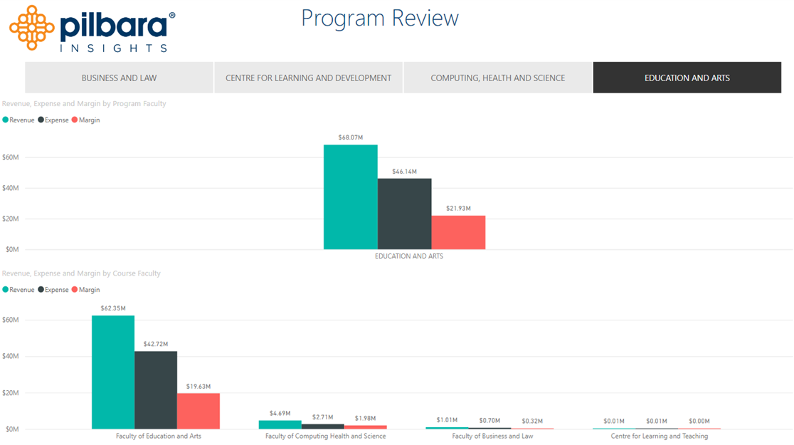
Owned vs Taught is quite a common report as well, it highlights the actual financial cross-over between schools / faculties, this covers situations where us engineering students have to take English classes because of our English sucks! In this example both the Faculty of Computing Health and Science and the Faculty of Business and Law are contributing positive margin to the Faulty of Education and Arts.
Program Review – Owned Vs Taught – Detailed
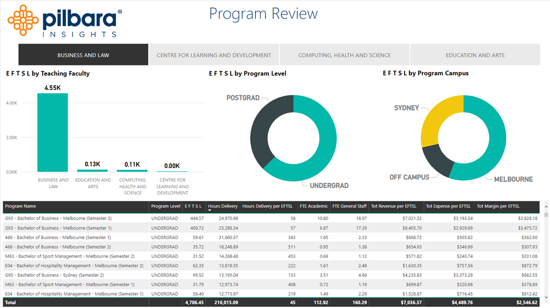
By going to a deeper level, Owned vs Taught can be assessed at the individual program level as well. Here we can see all of the programs owned by the Faculty of Business and Law and a break down of where individual courses are taught at different schools by EFTSL (Student FTE), plus all of the specific details associated with every program. The data can also be viewed by a wide-range of various dimensions including, in this example, Program Level and Program Campus.
Workload #3

Workload analysis came in at the number three spot. I skipped over the summary page because it’s just a high level overview of the institution. Workload is particularly interesting to see which schools may have overworked staff. These reports are using dummy data, so please don’t read anything into it.
This report example shows the Supplied Hours (Green) which are the actual available hours to work for academics. The Academic Delivery Hours (Dark Grey) are the estimated hours required to teach all the related courses based on workload profiles in the model. Profiles include time for teaching, marking, admin, student support etc. As an example, looking at the report in the top left, we can see Engineering requires more hours to teach than are currently available and Exercise and Health Sciences requires less hours to teach than are currently available. This doesn’t mean Exercise and Health staff are underworked, it means that this will require more analysis to see if they are working in other areas that are not captured in the model, like in clinics, or the profiles might not be correct. The profiles are key to this whole process and need to be correct for proper analysis. Collecting and reporting them like this is an excellent way of reviewing them with faculty.
It’s also interesting to view from a research and teaching perspective. It’s no secret that teaching subsidizes internal research, so highlighting the specific ratios per school provides insight into just how much research is being subsidized.
Courses #4

The course quadrant is a nice way of identifying the financial performance of individual courses but also, depending on where it sits in the four quadrants, allows actionable steps to be considered. Each course is plotted in a scatter plot with their respective EFTSL (Student FTE) numbers and margins. Top right is the place to be, lots of students and high margins. Bottom left is the bad quadrant, low numbers of students and low or negative margins, so these courses need serious review. For the other two quadrants we have, top left, with large numbers of students but low margins, can the delivery of these course be optimized? As an example reviewing things like delivery method, class size, number of instances/sections (i.e. is the course taught in multiple locations or multiple times and can these be consolidated?). The final quadrant, bottom right, have high margins but only a small number of students, could student numbers be increased with targeted marketing or is there actually a capacity bottleneck at the institution that doesn’t allow more students and can this bottleneck be removed?
Transparency in Higher Education Costing #5
No surprise that this comes in at the number 5 spot, it is a mandatory report for Australian universities to provide to the Federal Department of Education, so every university has to have this report and review it prior to submission. This is one of the major benefits of the model, the spreadsheet required for submission can be automatically populated from the model, so makes the process super efficient.
Other Noteworthy Reports
Program Financial Forecasting
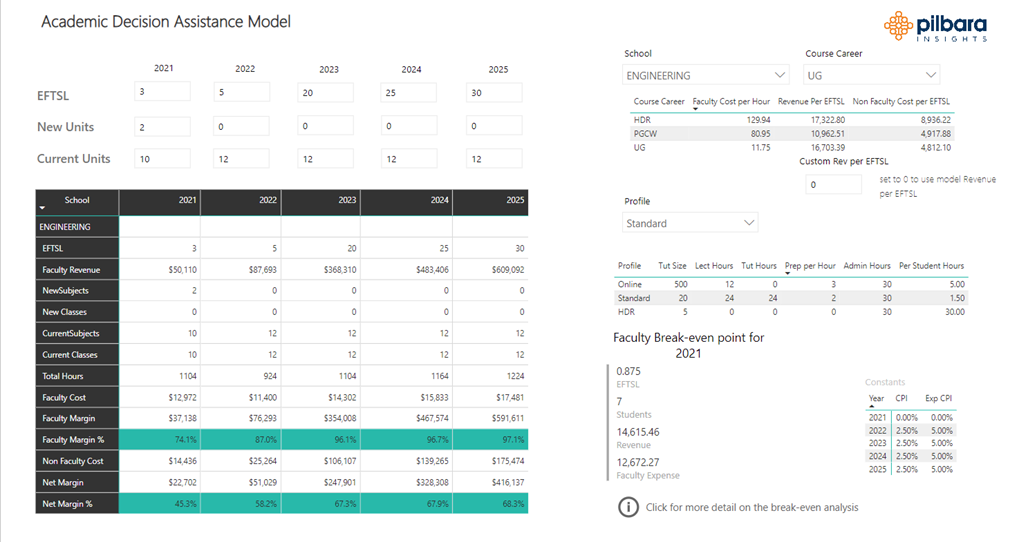
The Program Forecasting tool allows university staff to instantly develop a five year financial forecast for a new proposed program. The tool uses post-processed data from the underlying model and because the numbers are based on cause and effect allocations, they can be used to produce a reasonable estimate of future expenses. By including revenue and estimated student numbers, the review team can instantly see the forecasted margins and the tool will also calculate the break-even point for the program. It should be stated that this is a starting point, but allows a number of new programs to be reviewed instantly and those of interest can be analysed in more detail later.
Environmental Reporting
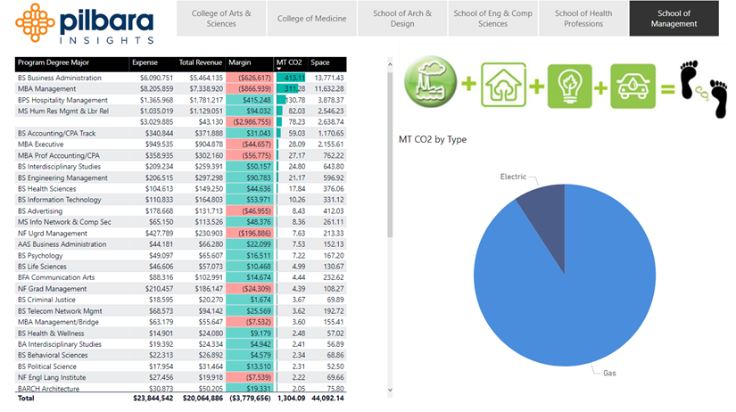
Climate Change! It’s a big topic of discussion and many organizations are trying to work out where to start to reduce their environmental impact. It’s quite a complex issue with a large number of factors to consider. To make things a little easier, environmental metrics (if you have them) can be incorporated into these models and included in financial reporting. This way you can assess both financial and environmental costs associated with individual programs and look for the most efficient way of reducing carbon emissions. This can also be used to identify any cost increase to reduce emissions i.e. if there is a requirement to invest in greener processes or renewable energy sources (solar farms), this will quickly highlight the “green premium”, the cost increase of going green. The trick is, what do you do with this knowledge? Can you increase tuition (where possible) for a greener program? Do you just accept it as a cost of doing business? Can you reduce both the financial and environment cost over time?
Research Reporting
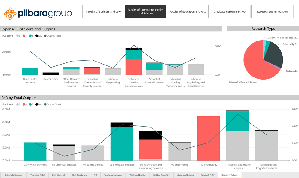
Other non-financial metrics can also be incorporated into the model and included in the financial reports, like research metrics. This was specifically requested by one of our client universities. This provides insight into the financial and performance aspects for various Fields of Research (FoR). This can help with deciding whether the institution should stop supporting low Excellence in Research for Australia (ERA) Scores and invest more in moving 4’s to 5’s, as an example. There is, of course, a lot more to this decision making process, but this is an example of how the model can contribute some data to that process.
Just this week the Education Minister in Australia has asked universities to discontinue preparation of their 2023 ERA reporting while the Department undertakes a review of the Australian Research Council. Regardless of the outcome, there will still be some type of performance or funding metric that can still be incorporated into the model and included in the financial reports.
CGS Caps Analysis
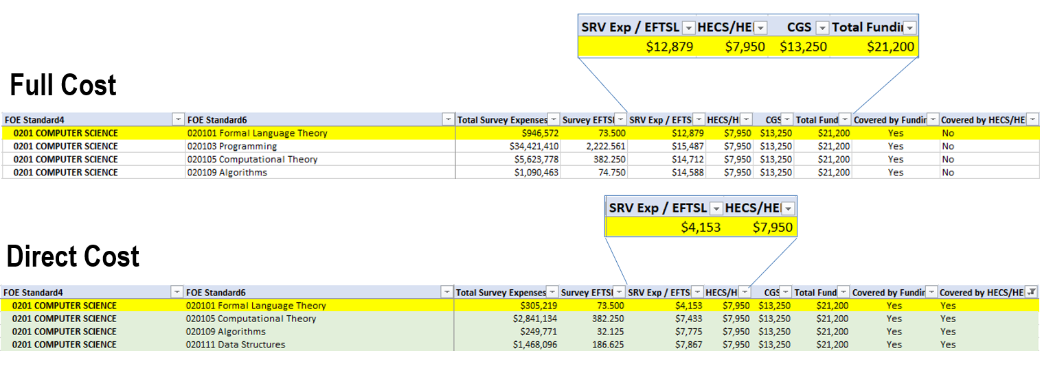
This example is very specific to the Australian University sector. I won’t go into detail, but by way of quick explanation, Commonwealth Supported Places are funded by a combination of Commonwealth contributions (Commonwealth Grant Scheme – CGS) and student contributions. Both of these vary by field of education. Students can pay their component out of their own pocket, or receive a loan (Higher Education Loan Program – HELP, formerly known as HECS) from the Government and pay it back when they start earning income. The Commonwealth sets specific caps on the number of places that can receive CGS.
We were asked to undertake a CGS caps analysis just recently, in particular assessing the difference between full cost and direct cost. In this example the HELP amount is not covering the full cost per EFTSL for Formal Language Theory but it does cover the Direct Cost.
Using full cost analysis is a great way of understanding which FOEs are covered by HELP and which ones are not. However, by reviewing Direct Cost only we can see which FOEs could be considered to exceed the cap due to the fact that HELP exceeds the Direct Cost so is contributing to some of the overhead, just not all of it.
Collaborative Analysis
It’s a great exercise to review all of the reports that are being developed and used by all of our client institutions. Our area of expertise is the development of large-scale, complex cost models, we are not experts in managing universities. This is where we would like to work with institutions and experienced higher education leaders/managers to collaboratively develop reports using the large amount of consolidated data available to us.
For the institutions that currently use our model, the data is your data, so should be used for your benefit. We have already started this process in Australia with our annual benchmarking exercise, but there could be a lot more valuable insight in the consolidated dataset. I should state that this dataset is aggregated and anonymized and it will be opt-in only, that is, we would seek the express permission of each institution before including their data. Early days yet, so stand-by for future updates!