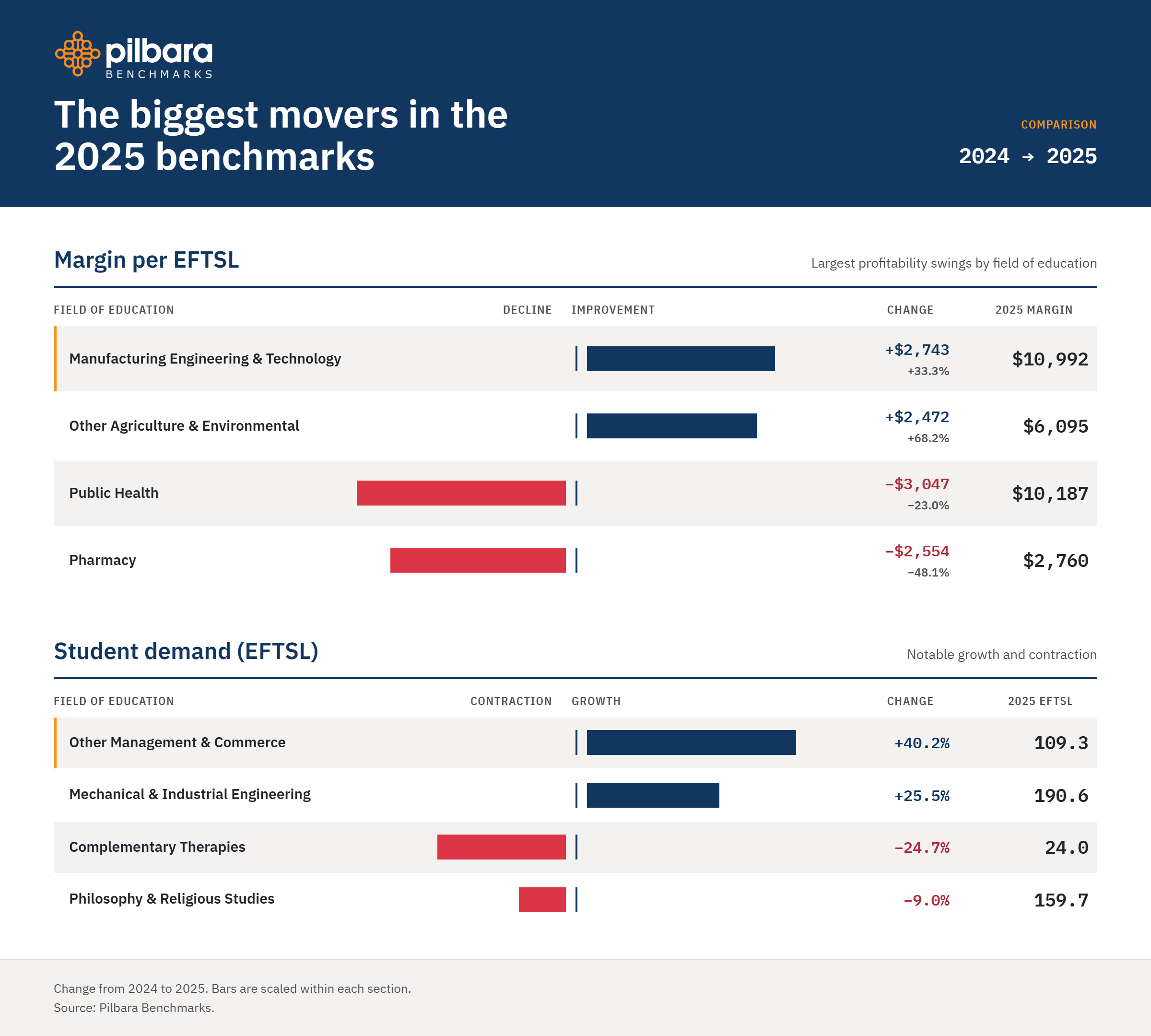
Excited to announce that the 2025 Higher Ed benchmarks for Australian universities are now available. It takes a while to get this data together because it’s built up from detailed models of universities and not from surveys. The models are built from detailed source systems including financial management, HR, payroll, facility management, student management and timetabling data and all resources are allocated to all subject instances (when, where and how they are taught), aggregated into their respective academic programs, noting the many-to-many relationship between programs and subjects. The model will also allocate all overhead as well, so the cost calculated to provide teaching is the full cost. The model also contains the appropriate Field of Education for each subject and it’s the Field of Education that is used as the standard comparator between all universities. The results from all of the models are then anonymized and aggregated into the full benchmarks for the sole use of the contributing universities and are not publicly available, but we do provide a private preview of a small subset of this data for interested university managers. To gain access to the full benchmarks your institution will need a model built and to agree to contribute your anonymized results to the benchmark pool. If your institution would like access to the benchmarks, please contact us here or comment below.
The benchmarks only contain data for Australian universities at the moment; we are actively working on creating a US version when we get a sufficient number of US institutions with their own models.
The important thing to note for the benchmarks, is that it is not just a comparison tool – e.g. Is my Cost per EFTSL for Mathematics higher or lower than average? It will also help you work out why your cost differs, starting with simple things like, is it a cost issue or an EFTSL issue? How do my workloads compare to other institutions? How do my salaries compare? Have all costs been rising since 2021?
Outside of these analysis capabilities, two other use cases include one university using the benchmarks to support their budgeting process (something other universities are looking at as well) and another university using the benchmarks to support their ATEC Compact negotiations.
The other big announcement is the completion of the benchmarks MCP server, which allows you to connect your existing AI to the benchmarks and we expand a little on this below.
With that introduction out of the way, let’s take a little tour of the new and improved benchmarks experience. We have spent a bit of time working on a new user interface, new reports and new metrics.
New Home Page
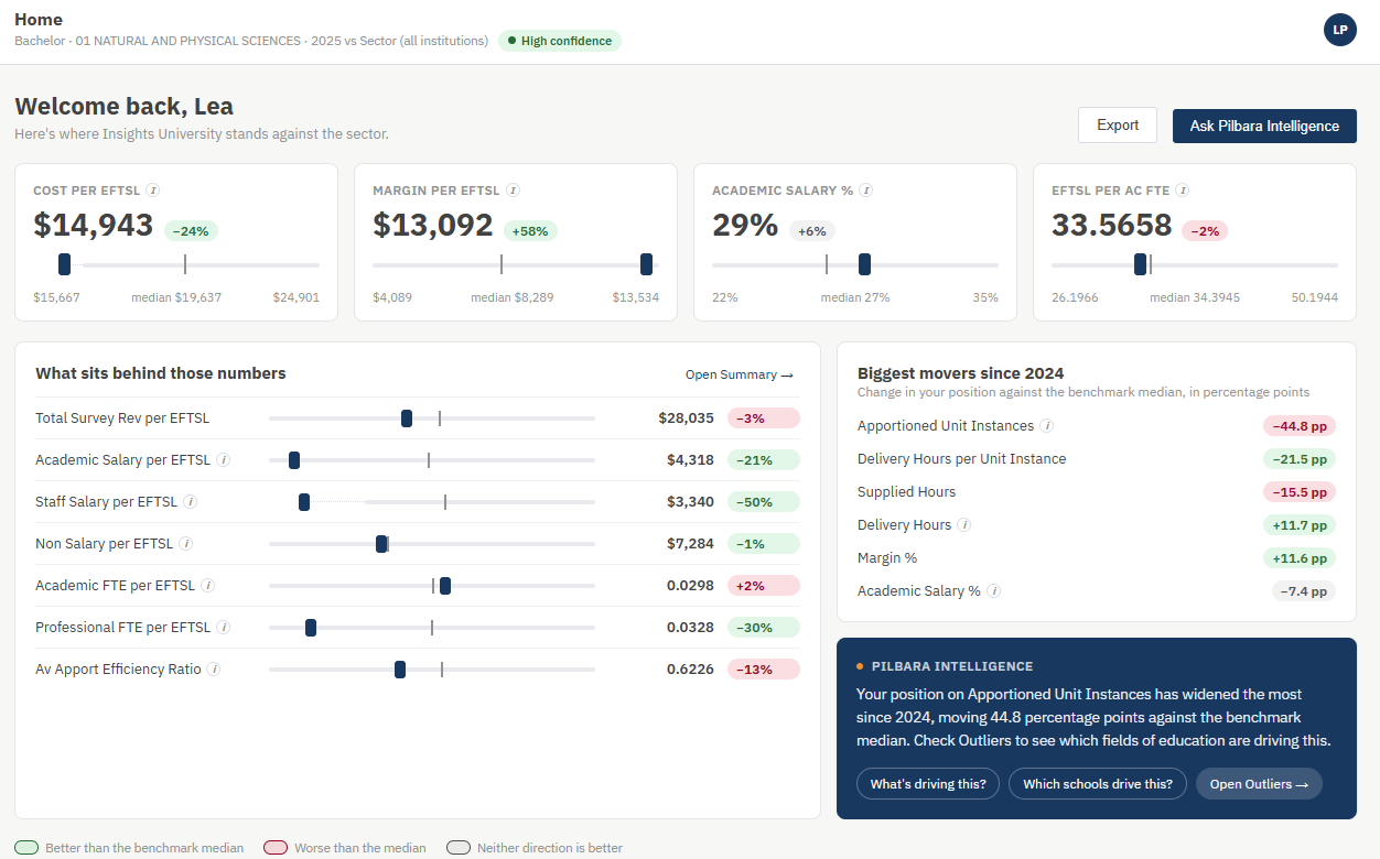
The new home page provides a high-level summary of key metrics for your institution, in this case for our fictitious institution, Insights University. We have also incorporated our AI solution Pilbara Intelligence in the home page to highlight any key issues it may have identified for your institution with some recommended next steps for analysis.
New Summary Table and Rails
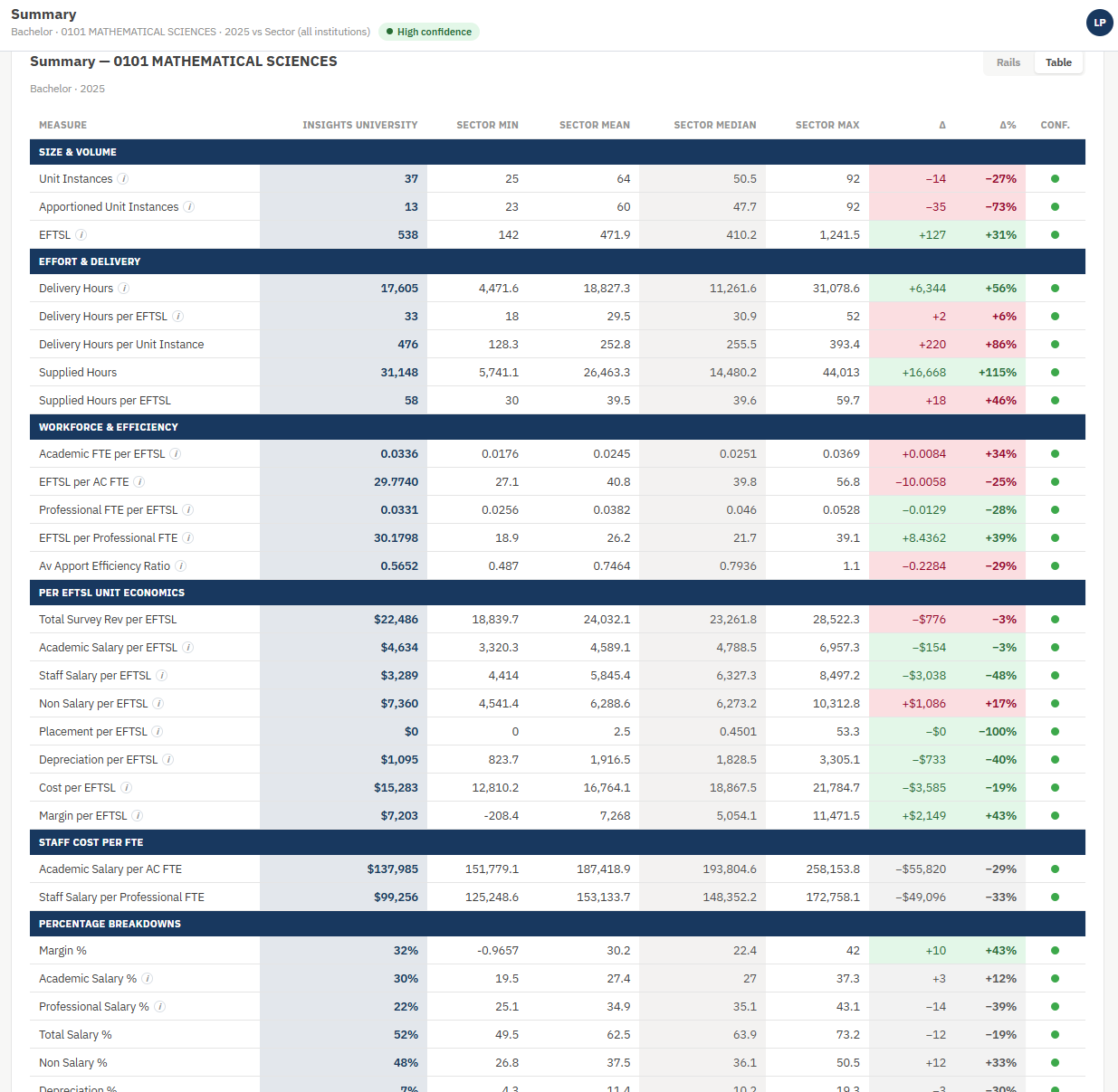
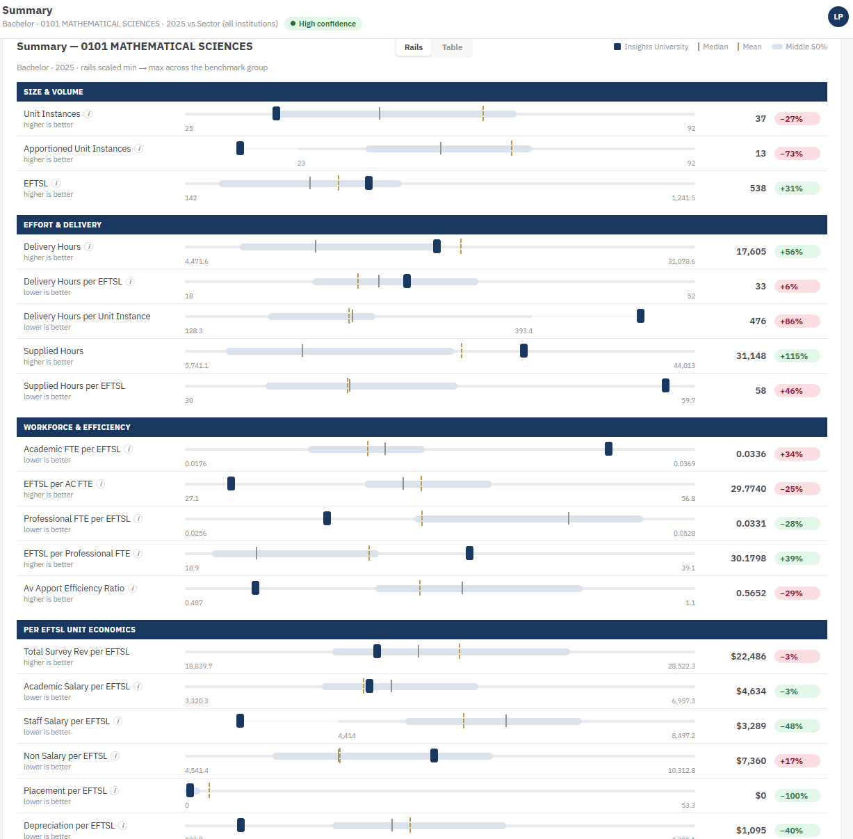
The summary table and rails report provides all metrics against the selected 2 digit or 4 digit FOE and also compares your institution to these metrics. Some things to note when using the benchmarks for your own analysis, it’s best to compare yourself against the median rather than mean/average and also consider the range from minimum to maximum for each of the metrics.
New Trend Explorer
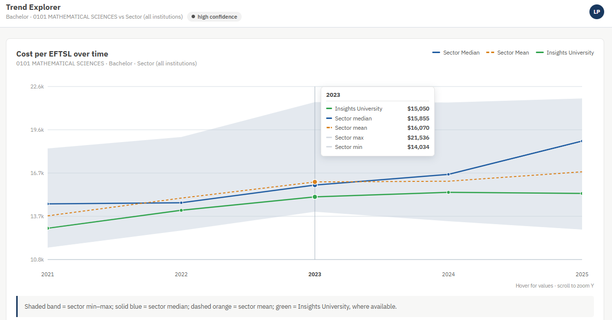
As you can see the trend data now covers 2021 to 2025 and highlights where your institution sits between the min and max grey boundary, plus mean and median metrics.
New School Comparison
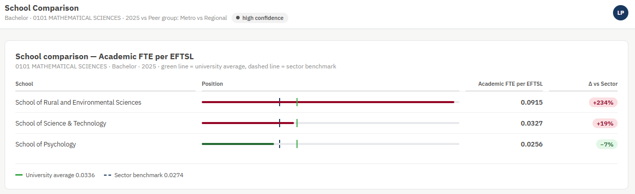
We now have the ability to compare individual schools to the sector benchmarks and also to your own institution’s averages. In this particular example, we are also comparing against the peer group of Insights University, which is a regional university. So, the sector in this case relates to only regional institutions. We can change it to the full sector if we want to make that comparison as well.
New Outliers Chart
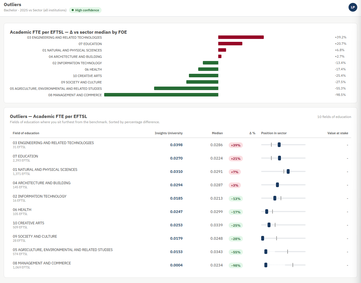
The Outliers chart has an updated look and shows the key outliers at your institution compared to the benchmarks median results.
New Quadrant Chart
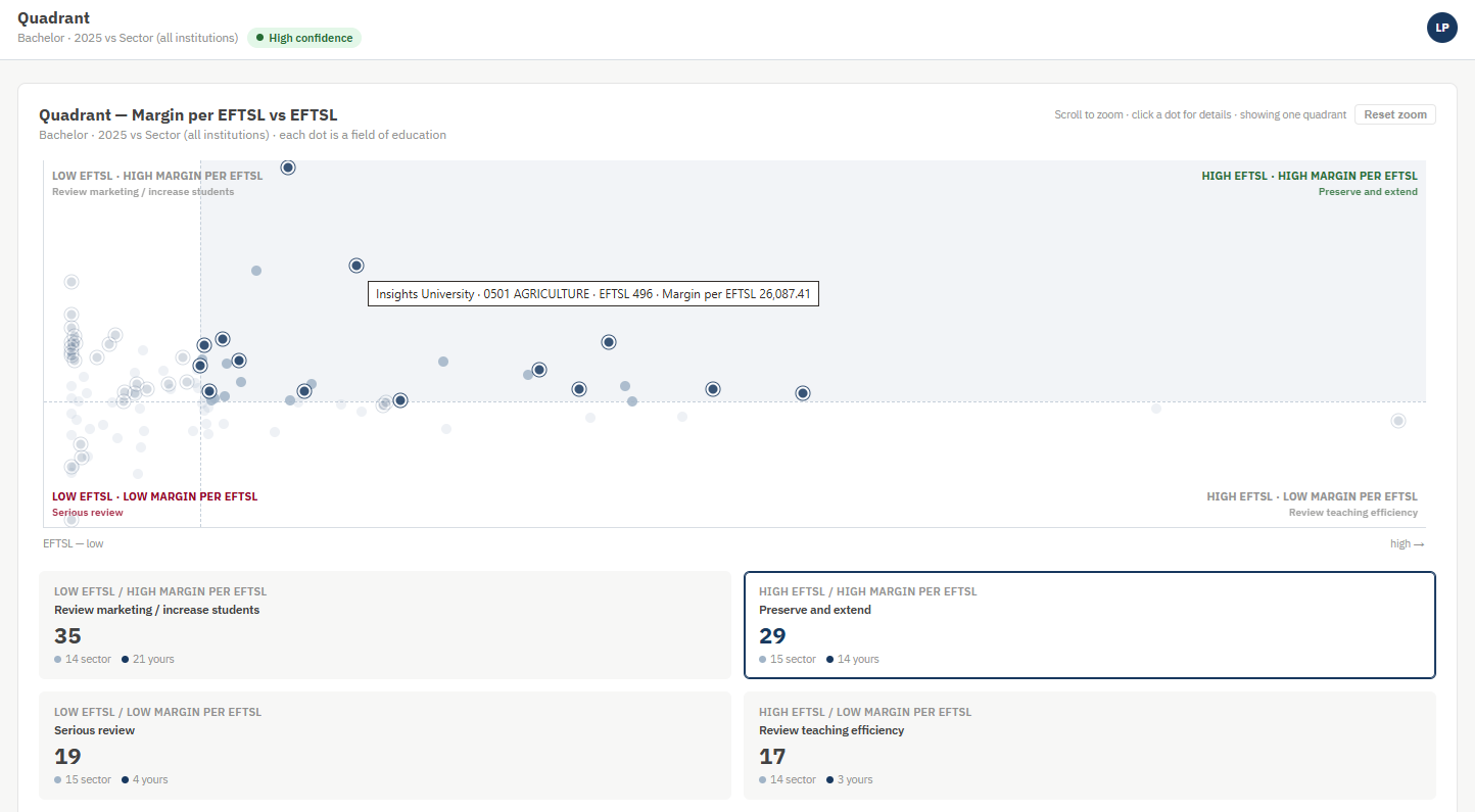
The Quadrant Chart now provides the ability to select “Cost per EFTSL” and “Revenue per EFTSL” as well as the standard “Margin per EFTSL”. You can highlight the particular quadrant you are interested in and hover over any point to get more information on that FOE. For the “Margin per EFTSL” report, it also provides handy little action guides in each quadrant namely “Preserve and Extend”, “Review marketing / Increase Students”, “Review teaching efficiency” and “Serious review”.
New Report Builder
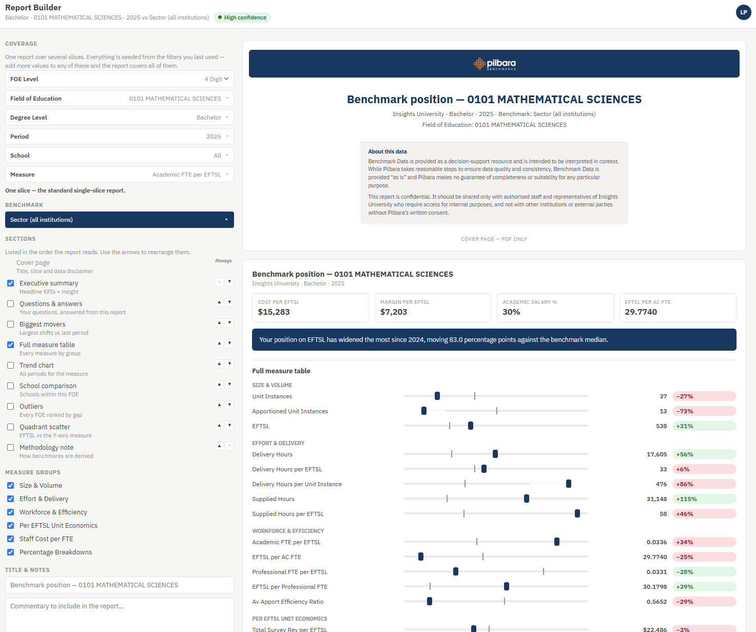
The Report Builder allows you to craft a formal report using the data from the benchmarks and include specific sections, your own commentary as well as any Pilbara Intelligence queries you might run.
New Pilbara Intelligence
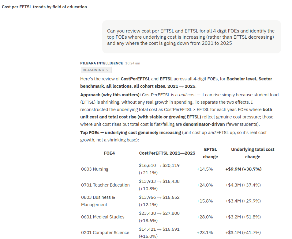
The new Pilbara Intelligence AI Analyst now saves all your previous queries.
MCP Server

We have now built our own Model Context Protocol (MCP) server for the benchmarks, which means we can connect your existing AI tool to the benchmarks, and it can bring the benchmark data into the AI analysis you are currently undertaking. We now have it working in Anthropic Claude and Microsoft CoPilot already and working on all others over time. If you have a specific AI tool you would like us to connect with, please let us know, we are more than happy to extend this to as many AI solutions as we can.
Benchmarks Data Sneak Peek